Concept Launch
About 'Concept'
I have been meaning to write an online notebook since launching as the Bakemonger. It has taken until now to really know what I want to talk to you about.
The Bakemonger is my creative outlet, I have firmly swapped yarns, textiles & loom for flour, sugar, eggs & magic. Using edibles as my medium, I strive to create both innovative & delicious design. Food excites me. I love how it is not only essential to our very existence but is social and hugely enjoyable. What a fabulous world to be a part of.
'Concept' is a place I wish to share with you my creative process: my thinking, my brainstorming and the route I take from conception to creation. I feel like there is so much more to say than just sharing my final designs with you. I 'think' before I 'do'. My training as a trend forecaster means I analyse and consider what is happening and what will happen next, what feels fresh, what is new and what is the future. Often my designs become something entirely different to their original intention. An experiment gone right, or even wrong can lead to the most wonderful of things. In this notebook I'd like you to join me on this journey.
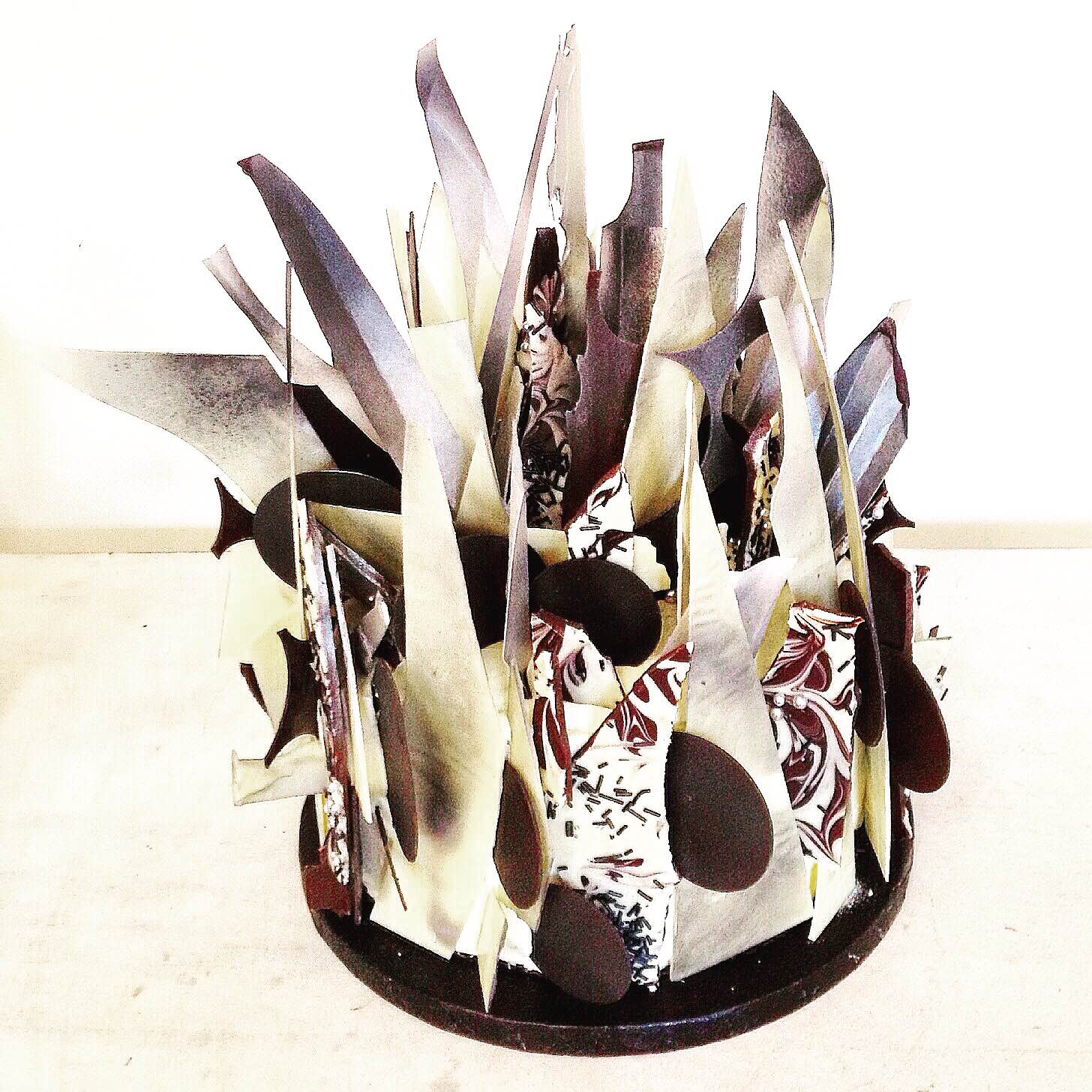
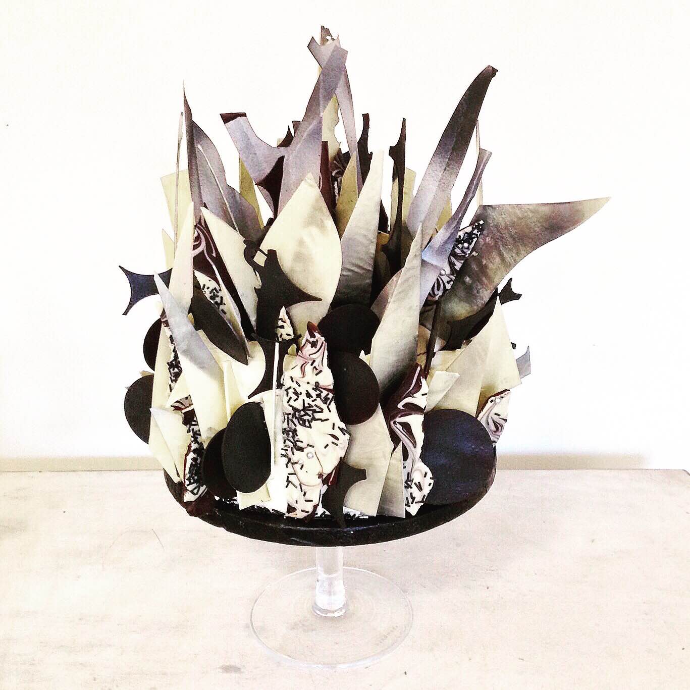
'Brutalist Geometric' Cake Sculpture.
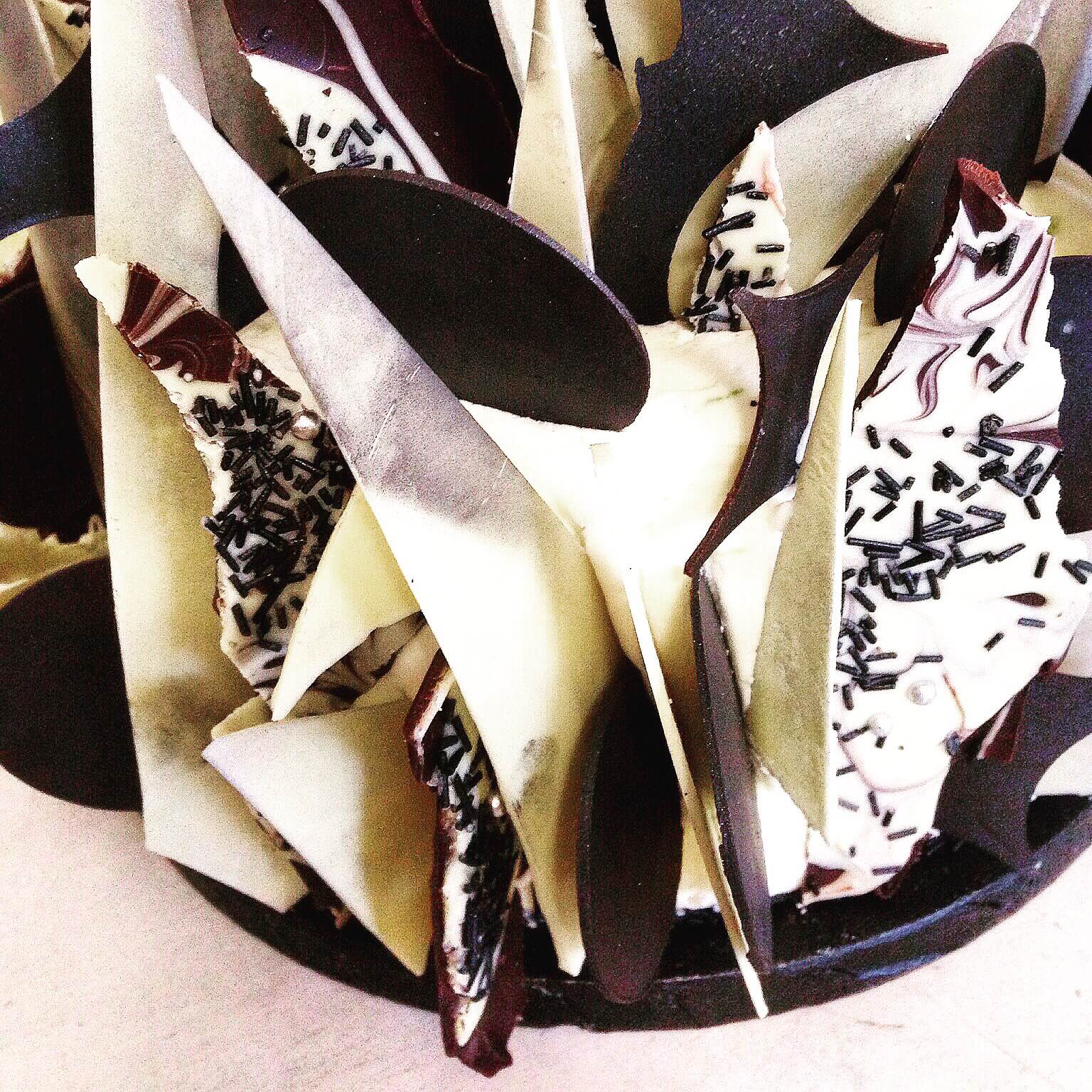
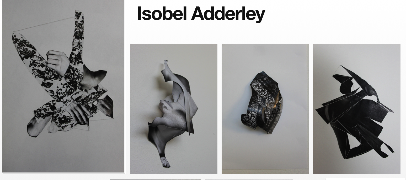
So here goes, lets talk about the Brutalist Geometric Cake Sculpture I created soon after my business launch. Firstly this was a really exciting brief, a birthday cake for Isobel Adderley, an artist in training at Goldsmith's University of London. Using her tumblr feed, her art work and her experiments as my inspiration, I wanted to create something she would love and abstractly represented her work. The word 'abstract' is really key for me. When I'm given a brief, I don't like to interpret it literally. I'm not about creating fondant figurines. I look at shapes, forms, textures and colours derivative of my inspiration and then I create something representative. That way my design in itself has a creative identity of its own. I always combine and layer together the inspiration, hence the abstraction and then the unique design.
Initially I always gather as much information as possible. You never know what will spark an idea or take you down a new innovative route so I gather more than I need. Manned with all kinds of visual references I sit down and I sketch, beginning to combine key details and elements I want to fuse together. Some things work, some things don't.
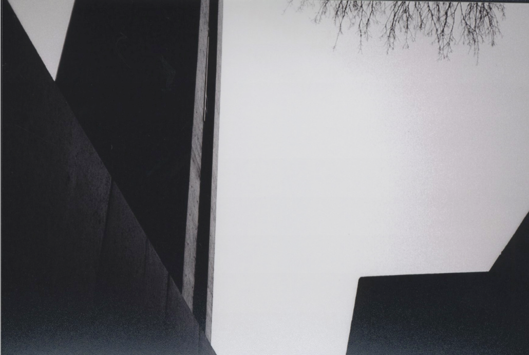
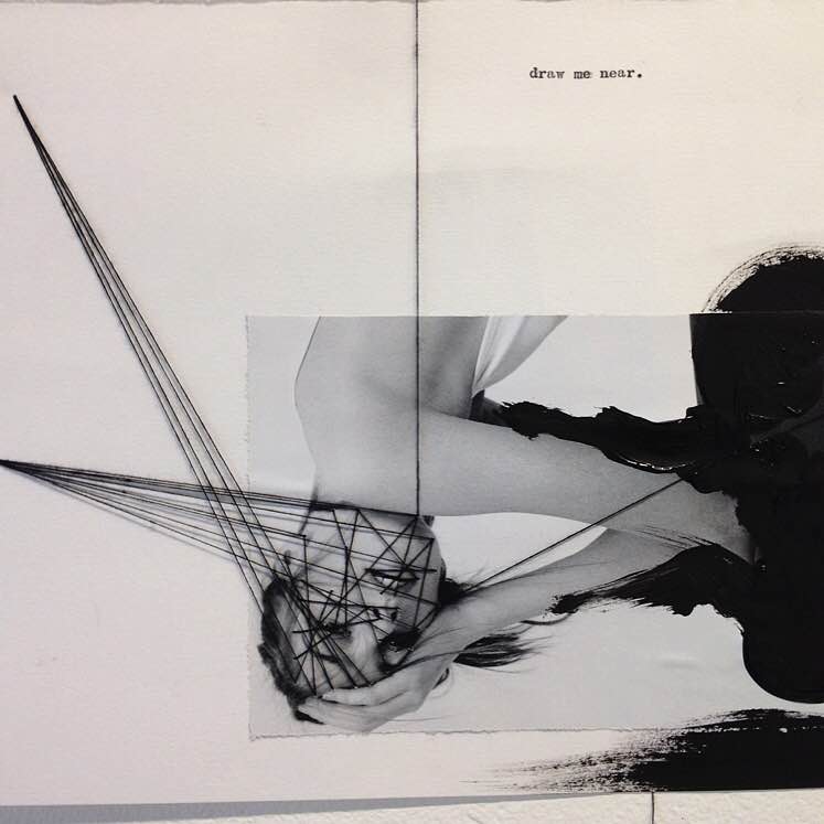
Isobel loves both brutalist architecture and geometry, so I knew I wanted to create something high contrast and monochrome representing the strong, cold, contemporary lines of the brutalists. Looking closer at Adderley's own work I loved the collaged, shaded, marbled and overlayed visuals - these make perfect edible inspiration. My background in constructed textiles naturally leads me to overlay and fuse textures together, as though they are yarns criss crossing in weft and warp.
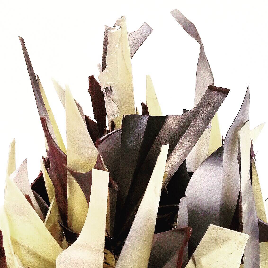
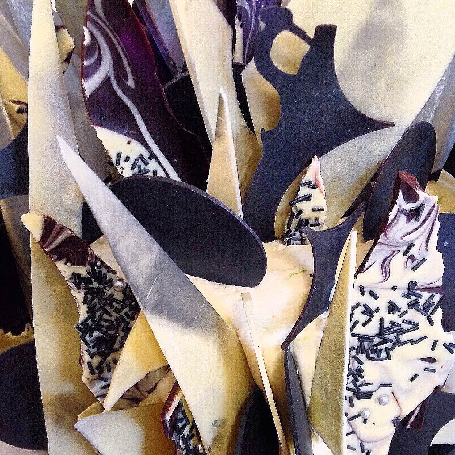
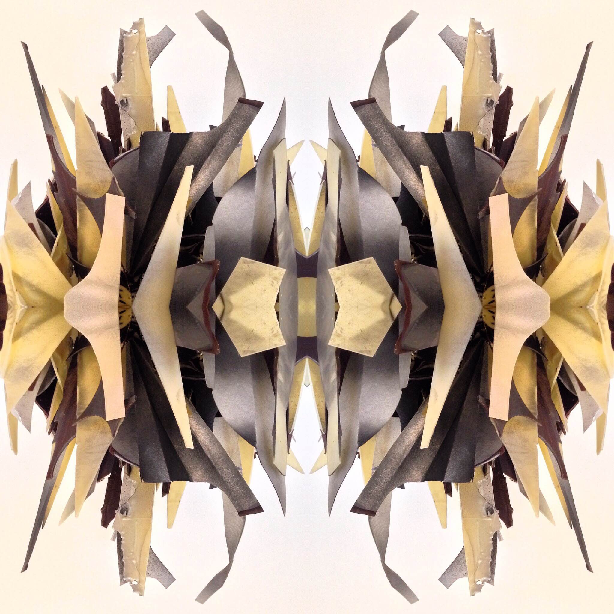
I had been wanting to create a monochrome cake for some time, apart from the fact that I felt 'black' was (is) very much trending in food, I personally love graphic & high contrast design. I went with the monochrome palette of: black, white, gunmetal, pearl and silver. Using edible materials (never fondant icing) I layered, shaded, marbled and overlayed geometric shapes derived from Adderley's collages. Marbling dark & white chocolate, cutting into tempered sheets, using both the positive and negative cut out shapes, the sculpture really came to life. There is very rarely a front or a back to my designs, this is something I love.
During the design stage I planned to add some 3D fine lines as in Isobel's stitched abstract figurative images; the connecting threads 'tying together' the abstract geometric shapes. Having previously created an 'edible thread' for some 'cobweb' tarts, I intended to use this innovative technique. This is a great example of how designs can fluctuate from concept to realisation. Cakes are three dimensional, unlike my sketches, and so inevitably some details need adding, or taking away to achieve balance. In the making of the cake the addition of the edible thread was just too much and too intricate - so I omitted it. My initial designs are always reflected in the final creation, but the kitchen is where my sketches really come to life, it is here that the design is truly realised and takes on a life of it's own.
My love for monochrome, the 'fine art' inspiration here and the level of abstraction in this design was key for me. This was the first cake I created that truly represented what 'The Bakemonger' is really about. It became the first of many, but felt entirely apt to be the focus of my first 'Concept' notebook post.
Thanks for reading & come back soon,
The Bakemonger.


